 IndieBase
Table of Contents
Team Branding
How to customize your team branding with logos and colours
Team Branding
Give IndieBase your team's identity — upload your logo and set your colours so every record, report, and screen reflects your organisation.
Overview
The Team Branding page lets you upload a team logo and choose two brand colours (a primary and a secondary) that are applied throughout the app. You can now configure separate colours for light mode and dark mode, and upload a dedicated dark mode logo — so your branding looks sharp regardless of which theme your crew is using.
Your branding appears in the main navigation header, on patient record PDFs, in patient feedback forms, and in the team switcher. Branding settings are scoped to your team, so each team in IndieBase can have its own distinct look.
Before You Start
- You must be a team admin to access branding settings.
- Team Branding requires an active subscription. If your team's subscription has lapsed, the Branding link won't appear in the sidebar.
- Have your logo file ready. See Logo requirements below for the spec.
How to Get There
In the left-hand sidebar, expand the Configuration section and click Branding.
This opens the Team Branding page at /teams/{your-team-id}/branding.
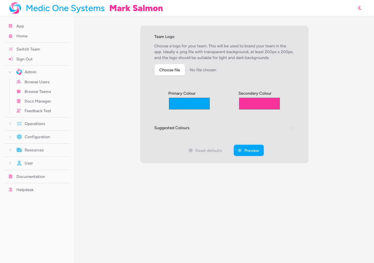
Uploading a Team Logo
Step 1: Open the logo uploader
On the Branding page, you'll see the Team Logo section at the top with a description and a file input. If no logo has been uploaded yet, a file picker is shown.
Step 2: Choose your file
Click the file input and select your logo from your device. The upload begins immediately once you select the file, and a progress bar appears while it's transferring.
Only image files are accepted: JPEG, PNG, WebP, and SVG. The maximum file size is 1 MB.
Step 3: Confirm the upload
Once uploaded, the file picker is replaced by a preview of your logo. The app shows it against both a Light and Dark background so you can check it reads well in both modes — use the segmented control to switch between them.
A toast notification appears at the bottom-right of the screen confirming "Logo updated".
Logo requirements
| Property | Requirement |
|---|---|
| Formats | JPEG, PNG, WebP, SVG |
| Maximum file size | 1 MB |
| Recommended dimensions | At least 200 x 200 px |
| Background | Transparent PNG strongly recommended |
| Colour | Should be legible on both light and dark backgrounds |
A transparent PNG works best. IndieBase uses both light and dark themes, so a logo with a solid coloured background will look out of place on whichever theme it doesn't match.
Removing the Logo
To remove a logo that's already uploaded, click the red trash button in the top-right corner of the logo preview area.
A confirmation is not required — the logo is removed immediately and the file picker returns. A "Logo removed" toast notification confirms the change.
Uploading a Dark Mode Logo
Below the main logo section is a separate Dark Mode Logo section, clearly marked as optional. This lets you upload an alternative version of your logo specifically for dark-mode displays.
If you don't upload a dark mode logo, IndieBase falls back to your standard logo in dark mode — so this section is only worth filling in if your main logo genuinely doesn't read well on a dark background.
Uploading a dark mode logo
Click the file input in the Dark Mode Logo section and select your file. The same format and size limits apply as the main logo (JPEG, PNG, WebP, SVG; max 1 MB). The upload happens immediately, and a "Logo updated" toast confirms it.
Removing the dark mode logo
Click the red trash button on the dark mode logo preview to remove it. Once removed, the standard logo is used in dark mode again.
Setting Brand Colours
Below the logo sections are two colour pickers: Primary Colour and Secondary Colour.
Light and dark mode colours
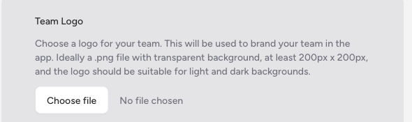
You can now configure separate colours for light mode and dark mode using the Light / Dark segmented control that sits above the colour pickers. Click Light to edit your light-mode colours, and Dark to edit your dark-mode colours.
Dark mode colours are optional. If you don't set them, the dark mode pickers display your light-mode colours as the default fallback — and those light colours will be used in dark mode until you explicitly set different ones.
What each colour is used for
- Primary Colour — used for your team name in the header, navigation links, and other prominent text elements throughout the app. Defaults to sky blue (
#00a6f4). - Secondary Colour — used for your name in the header, icon accents, and decorative elements. Defaults to pink (
#f6339a).
Both colours also appear on patient record PDFs and in patient feedback forms sent on your team's behalf.
Choosing a colour with the colour picker
Click either swatch to open your browser's native colour picker. Select your colour, then click away or close the picker — the colour saves automatically and a toast notification confirms the update.
Colours are saved as soon as you leave the colour picker. There's no separate save button for colour changes.
Configuring dark mode colours
Switch the segmented control to Dark, then use the pickers in the same way to set your dark-mode primary and secondary colours. The pickers will show your current light-mode colours as starting values if no dark colours have been set yet.
Using the suggested colour palette
If you'd rather pick from a predefined set than use the freeform picker, click Suggested Colours to expand the palette panel.
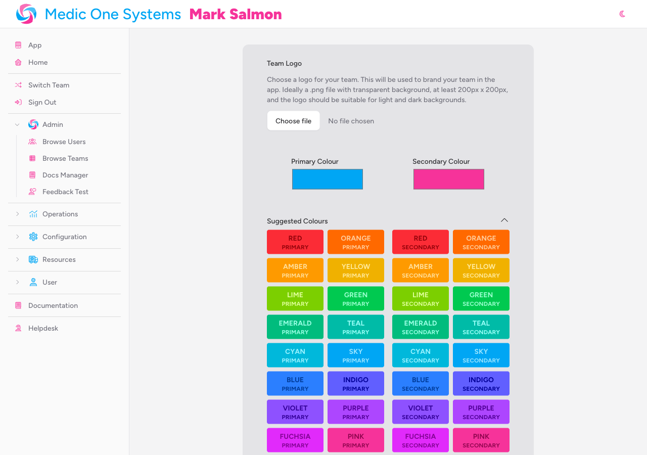
The palette offers 18 colours — Red, Orange, Amber, Yellow, Lime, Green, Emerald, Teal, Cyan, Sky, Blue, Indigo, Violet, Purple, Fuchsia, Pink, Rose, and Zinc — independently for Primary and Secondary. Click any swatch to apply it immediately. The suggested palette is available for both light and dark mode — switch between them using the segmented control before selecting a swatch.
Previewing Your Branding
Colour changes take effect across the app straight away, but if you want to force a full refresh to see everything updated at once, click the Preview button at the bottom of the page.
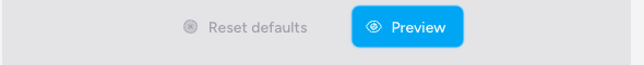
This reloads the page and applies all current branding settings.
Resetting to Defaults
To revert all branding colours back to IndieBase's defaults (sky blue primary, pink secondary), click Reset defaults at the bottom of the page.
Resetting clears both your light-mode and dark-mode custom colours, removes the dark mode logo, and restores the default colour values. Your standard logo is not affected.
Where Your Branding Appears
Once configured, your branding is applied consistently across the following areas:
| Location | What appears |
|---|---|
| Main app header | Your logo (if uploaded) replaces the default icon; team name and user name are coloured using your primary and secondary colours |
| Team switcher | Each team's logo and colours appear in the team switcher dropdown, making it easy to identify teams at a glance |
| Patient record PDFs | Your logo appears at the top of every printed or downloaded patient record |
| Patient feedback forms | Your logo and colours brand the feedback form sent to patients |
| Patient feedback emails | Your logo and colours are applied to the email notification sent alongside feedback requests |
In dark mode, the app uses your dark-mode logo (if uploaded) and your dark-mode colours (if set). If neither is configured, your standard logo and light-mode colours are used as fallbacks.
Troubleshooting
The Branding link doesn't appear in the sidebar. Branding requires an active subscription. If you don't see the link, check your subscription under Billing Portal in the Configuration section of the sidebar.
My upload failed with a validation error. Check that your file is a supported image format (JPEG, PNG, WebP, or SVG) and is under 1 MB. Files larger than 1 MB will be rejected.
My logo looks fine in Light mode but disappears in Dark mode (or vice versa). This usually means your logo has a solid background that blends into one of the themes. Export your logo as a PNG with a transparent background so it works on both light and dark interfaces — or upload a separate dark mode logo below the main logo section.
I changed my colours but the header still shows the old ones. Try clicking the Preview button on the Branding page to force a full page reload, which re-applies the latest colour settings.
I reset the defaults but my secondary colour still looks wrong. After clicking Reset defaults, click Preview to reload the page and fully apply the changes.
My dark mode colours don't seem to be saving. Make sure you've switched the segmented control to Dark before selecting colours. Colours only save for the mode that's currently active in the toggle.
I removed the dark mode logo but the old one is still showing in the app. Try clicking Preview to force a full reload. If it persists, clear your browser cache.
- Team Settings — manage your team name, address, and membership from the Team Settings page
- Template Config — configure clinical record options and feature toggles for your team
- Custom Panels — add bespoke data panels to patient records